
On agentic design
Overview
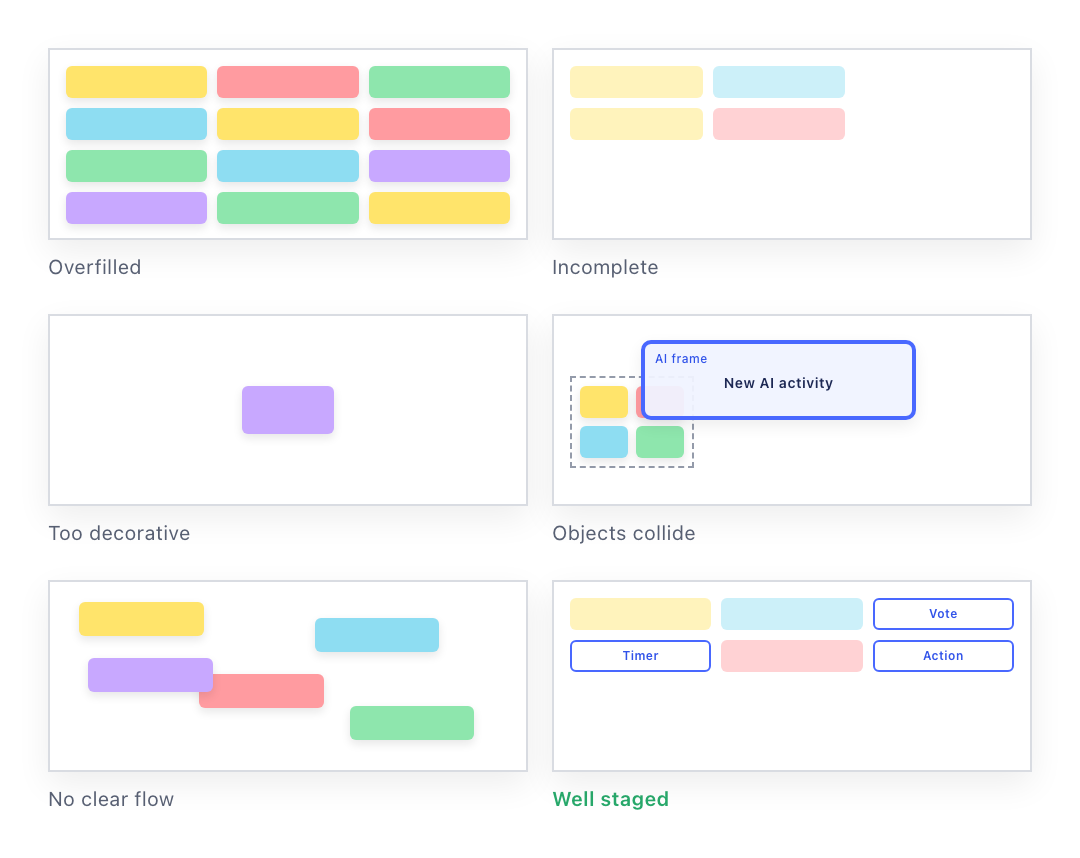
Miro’s AI could already place the right pieces on a board — the right notes, the right shapes, all correctly styled. The board it produced could still be unusable: overcrowded, dropped on top of work someone had already done, or filled in with opinions the team had never said. Designers spotted it instantly. Nobody could explain it in a way an AI, or the engineers building it, could act on.
This was a research project before it was a design one. I collected what the AI actually produced, sorted the failures into patterns, and turned the patterns into rules engineers could build and anyone could check.
- Role
- Design Manager
- Focus
- Agentic visual quality and spatial composition
- Timeline
- 2025 – 26
- Team
- [Team and key partners]
- Status
- First version, three collaboration formats
Long story, short.
Every other design-system MCP inherits a layout. An infinite canvas inherits nothing.
A design system made machine-readable answers the first question: what is this supposed to look like. The right sticky yellow, the right frame corners, the right connector. That part is solved, and it is not what this was about.
Every other design-system MCP gets to treat composition as already solved, because its components live inside a screen. A grid, a set of breakpoints, an edge — something underneath the component library decides where things go once the right component is picked. A button does not need to know how far it sits from the next button.
Miro’s canvas has no layout system underneath it. No grid, no breakpoint, no edge. Position, density, pacing, whitespace and sequence are inherited from nowhere. Composition has to be designed on purpose, as its own layer.
Approach
Study the output, not the intention.
Judgment about a generated board was fast, confident and completely unexplainable. Every designer looking at the same bad output agreed it was bad, and no two of them described why in the same words. So the method started from artifacts rather than opinions: gather what the system actually made, put weak and strong results next to each other, and only then try to name the difference.
01 / Collect what the system made
I kept the worst boards as evidence rather than filing them as bugs. Six outcomes recurred from the same prompt — overfilled, incomplete, too decorative, colliding with work someone had already done, no clear flow, and occasionally a good one. The pieces were correct in every one of them. Only the arrangement changed.
Three kinds of collaboration
Narrow enough to build, different enough to catch a false pattern.
I compared the ways teams work together in Miro by how often each happens, how complex it is, how bad the AI results were, and how teachable the patterns would be. Three rose to the top, chosen to be different enough from each other to show whether a rule really transferred or just happened to work once: retrospectives, which are columns; ideation workshops, which spread around a prompt; and project reviews, which run in sequence.
Then I sorted the failures into groups. Seven held across all three formats: no clear start, random spacing, weak separation, unclear sequence, mismatched objects, visual noise, and content the team never said.
One rule, written three times
Be deterministic about purpose, flexible about expression.
Vague advice like “make it feel spacious” leaves the AI guessing. Fixed templates remove the point of using AI at all. The work was deciding which choices must always go one way to protect the experience, and which stay open to the situation — then writing each decision once for each of the three readers who had to act on it.
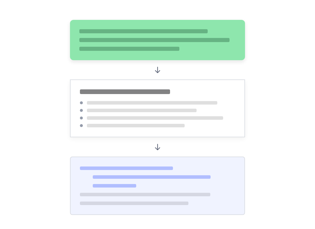
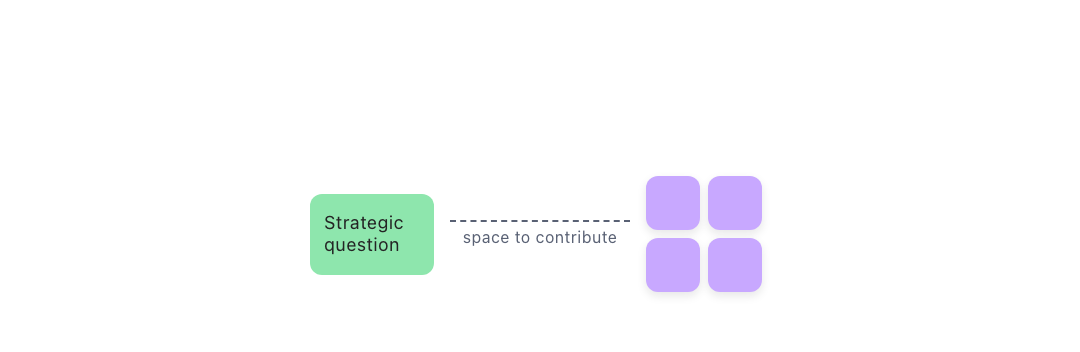
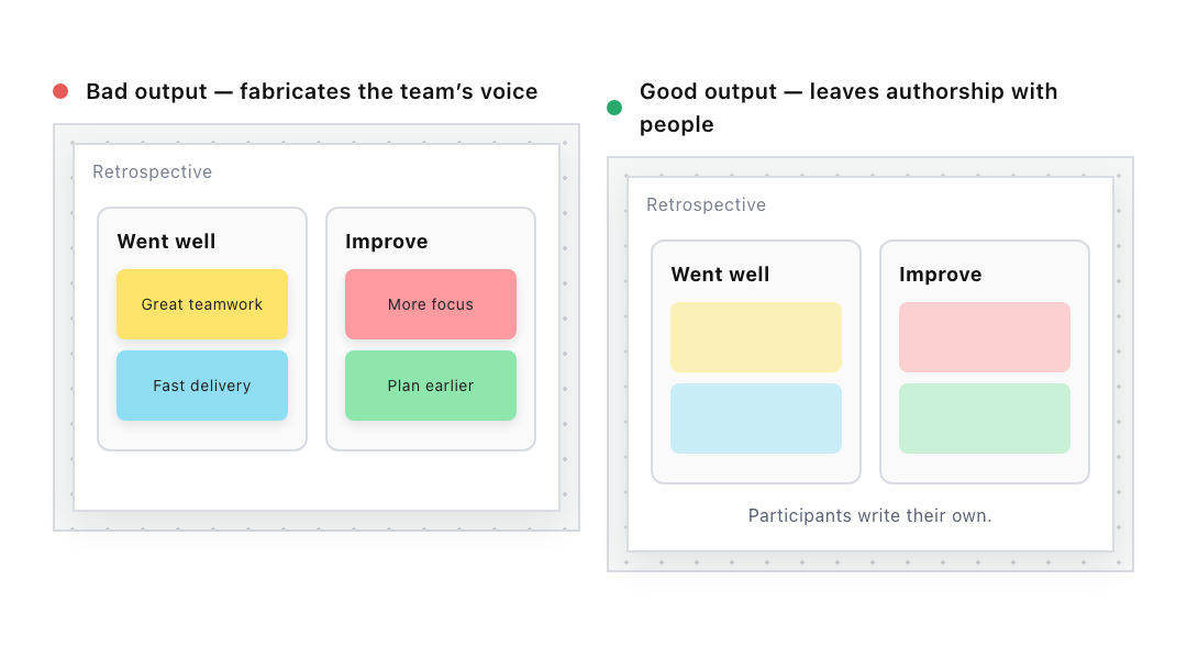
The rule that started the project: a retrospective is where a team says honestly what went well and what did not, and the notes are there for people to fill in themselves. When the AI fills them with believable-sounding feedback the board looks finished, but the team’s real opinions have been replaced by a guess before anyone arrived. Empty sticky notes are not unfinished.
One decision, three readers
Each rule was written three times, because three different readers had to act on it. The principle names the collaborative purpose the choice protects: people remain the authors of their own experience, so the AI prepares a place for contribution rather than filling it.
The design rule turns that into behavior anyone can recognize on a board. Leave contribution areas empty by default. Only add sample content when the prompt asks for it. Label any sample as an example. Never fabricate summaries, votes or participant input.
The machine-readable rule makes it concrete enough to implement:
participatory_activity → contribution_areas.default_content =
          empty
, with samples opt-in and always labeled.
What position means on a shared canvas
Layout is behavior.
On a page you read top to bottom and everyone knows it. An endless canvas has no such order, so position itself carries meaning. Things in a row read as steps in sequence. Things stacked read as a pile of contributions. Things arranged around a central question read as an open exploration.
So the second half of the system is a spatial grammar: five patterns, each one a thing position already says to a person, and each one asking the AI to behave differently. Space tells people what order to work in, where to look, and whose work is whose.
01 / Sequence
Objects placed in a line read as ordered steps. Direction tells people where to begin and what happens next.
How AI should interpret it
Arrange stages along one clear axis, preserve their order, and attach each new step at the end of the path.

02 / Accumulation
Repeated contributions form a growing collection around a shared prompt. The group should expand without losing its center.
How AI should interpret it
Place new contributions near their source, reserve room for more, and grow the collection outward as people add content.
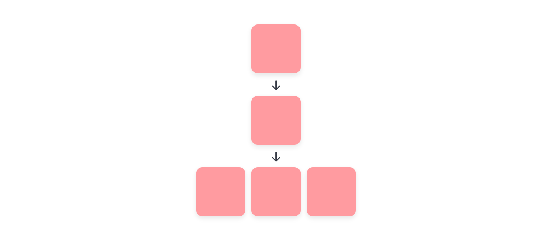
03 / Exploration
Ideas arranged around a central question signal open, non-linear discovery rather than a prescribed route.
How AI should interpret it
Keep the question at the visual center, distribute branches evenly, and avoid suggesting that one direction is the correct path.
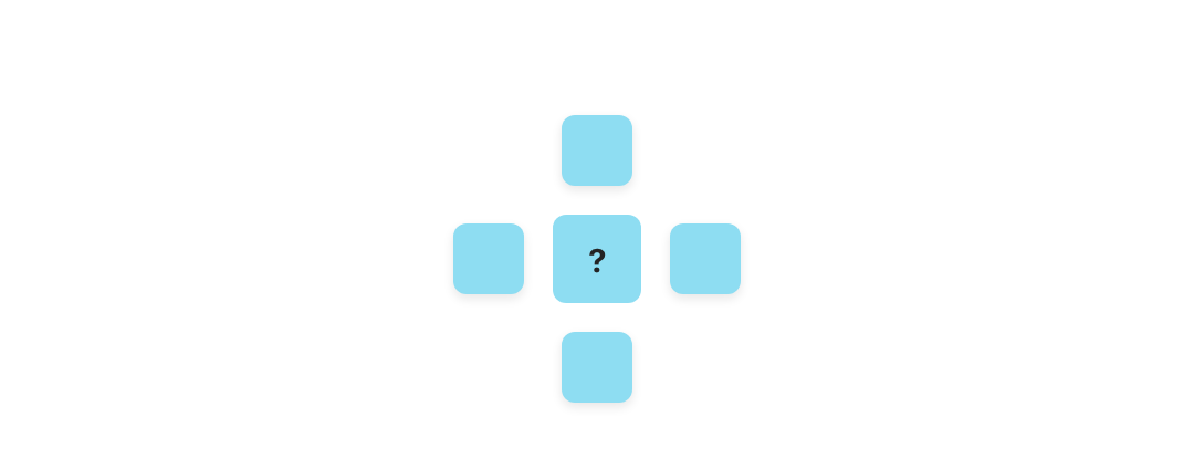
04 / Distance
Proximity expresses relationship. A larger gap creates separation; a smaller gap makes objects read as one group.
How AI should interpret it
Keep related objects close enough to scan together, and use visibly larger gaps to separate unrelated groups or phases.
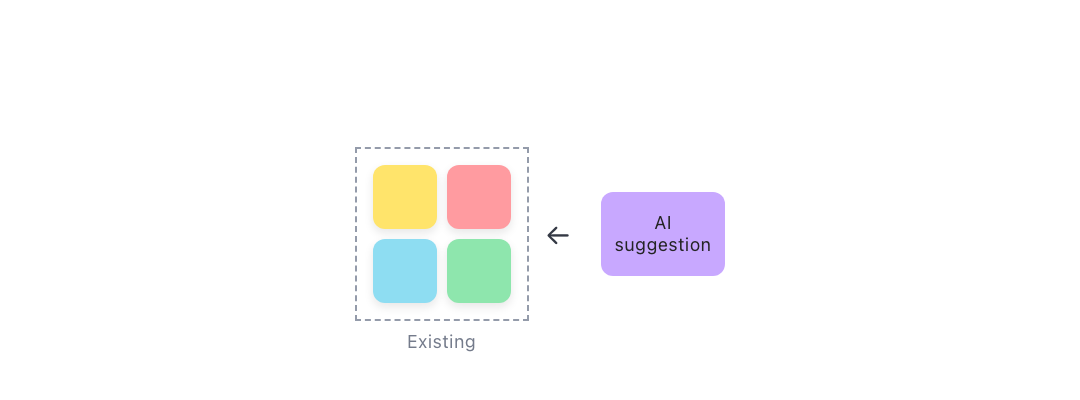
05 / Respect existing work
Human-authored content has priority. New AI material should extend the board without covering or displacing what is already there.
How AI should interpret it
Detect occupied areas, add related work beside them, and move AI-created material first whenever more room is needed.
Test the output, not the intention
Seven checks, each one the whole system compressed.
What the work produced, in its most usable form, is below: seven dimensions to test a generated artifact, each answerable by looking. Every principle, rule and specification behind them reduced to something checkable in a few seconds.
Their real value was diagnostic. When a board failed one of these, the failure pointed at something specific to repair in the system rather than in the board: a principle too vague, a rule too broad, two rules contradicting each other, or a situation nobody had accounted for.
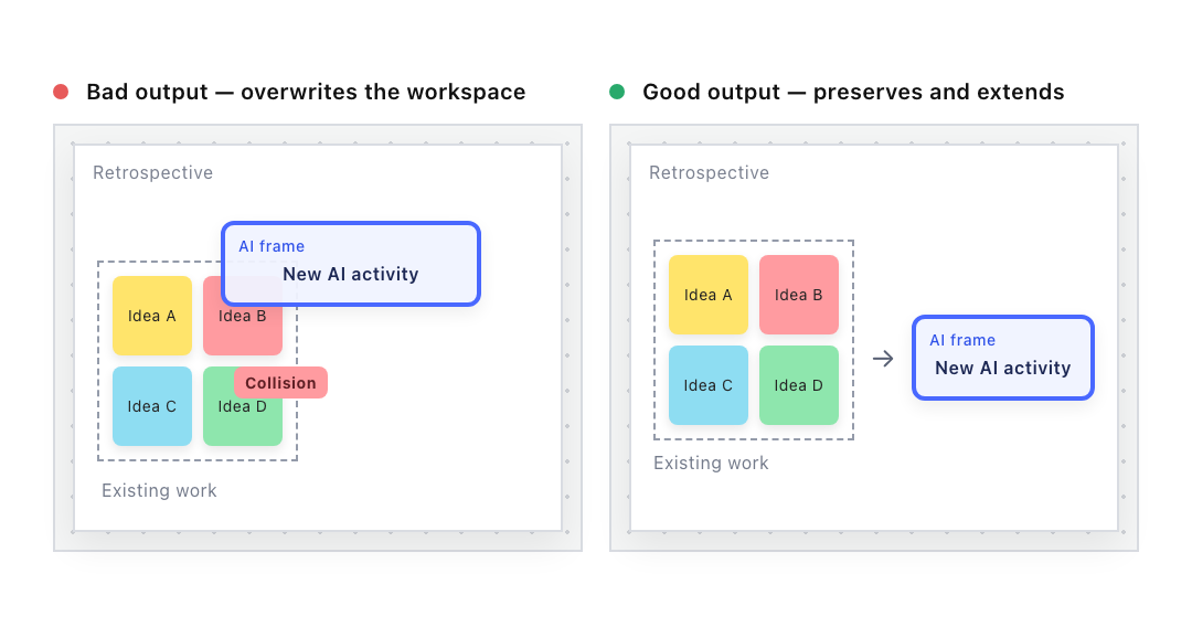
01 / Spatial safety
A new object should preserve existing work and attach to meaningful context without collisions.
Decision rule
Protect human-authored content first; reflow AI-created material before moving existing work.
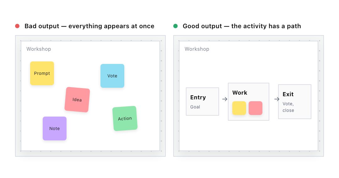
02 / Lifecycle clarity
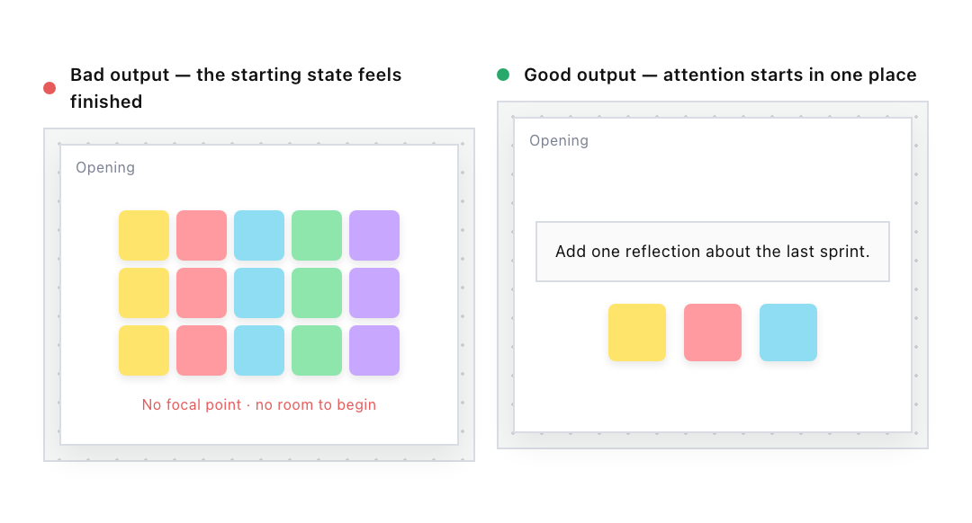
A participant should be able to see how to enter the activity, contribute, and reach an ending.
Decision rule
Express entry, participation and completion as distinct spatial phases.
03 / Psychological density
The amount of visible content should match what people need to think about in the current phase.
Decision rule
Begin with low density and let the board accumulate complexity through participation.
04 / Interactive integrity
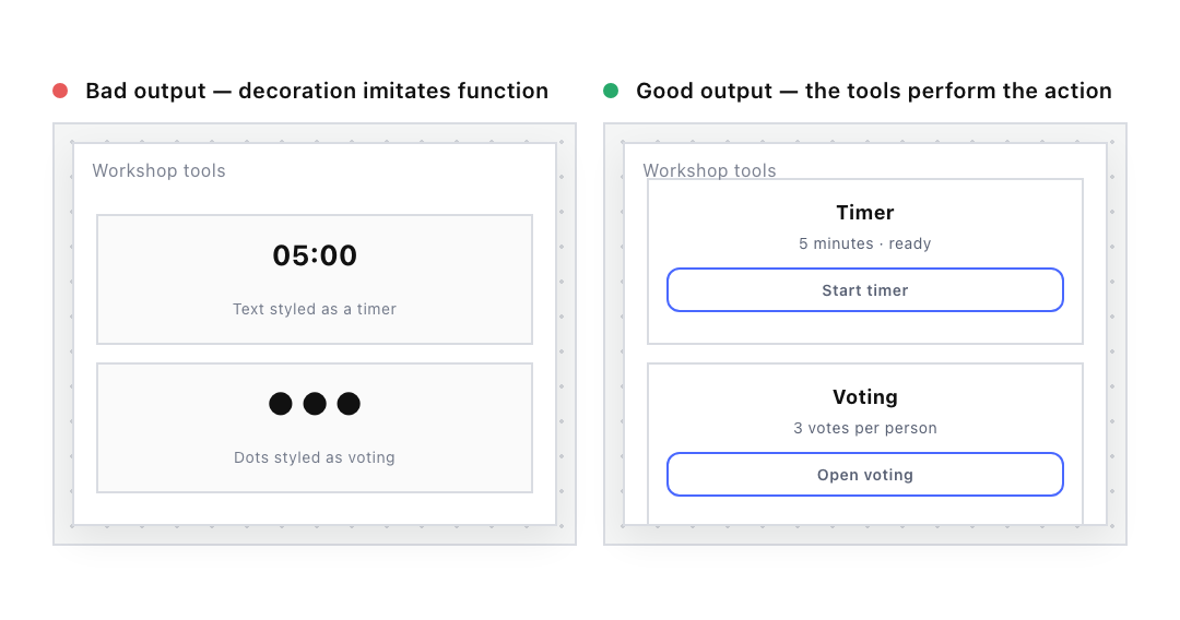
If an activity requires timing, voting or another action, the output should contain a working tool, not a picture of one.
Decision rule
Use native interactive objects whenever the activity depends on their behavior.
05 / Content authenticity
The AI can prepare contribution areas, but it should not pretend that participants have already contributed.
Decision rule
Contribution areas default to empty unless the prompt explicitly requests labeled example content.
06 / Output delivery
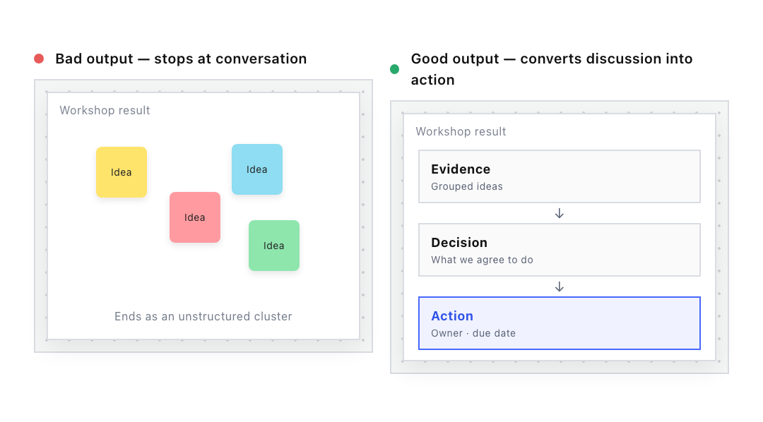
A collaborative activity should move the team toward a decision, commitment or next action.
Decision rule
Include an explicit destination for decisions, owners and follow-up actions.
07 / Product-language fit
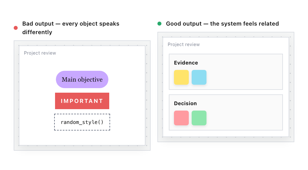
The generated board should use a coherent hierarchy, component vocabulary, tone and visual rhythm.
Decision rule
Reuse established components and hierarchy; vary expression only where the use case requires it.
What the system contained
- A written explanation of what makes a collaborative board good.
- A library of real results — good, bad, and in between.
- A set of reusable layout patterns.
- Rules tying each design choice to the purpose it serves, written so engineers could build them.
- The seven checks, plus a log of what changed and why.
Shipped outcome
A bad board stopped being something to fix by hand and became evidence about the system.
- Judgment became explicit: instead of “this board feels wrong”, designers could point to which principle it broke.
- Taste became buildable: engineers got specific defaults, limits and exceptions instead of a vague brief.
- Quality became testable: a failure named the part of the system that needed repair.
The method held across three different kinds of collaboration, which is what I set out to test. Whether it improves outcomes for real teams over time is the next thing to measure, and not something I’m claiming yet.
About
I’m drawn to problems where quality is easy to feel and hard to explain. Narrow the problem, use real examples so the argument moves past personal preference, and tie every visual decision to something it should make people do.
The translation between design and engineering is part of the design work, not a handoff at the end. These rules were written with the engineers who had to implement them, and several got narrower because a rule that read well proved impossible to apply consistently.
My job was not to make AI copy a designer’s taste. It was to make the reasoning behind that taste something other people — and a machine — could actually use.